
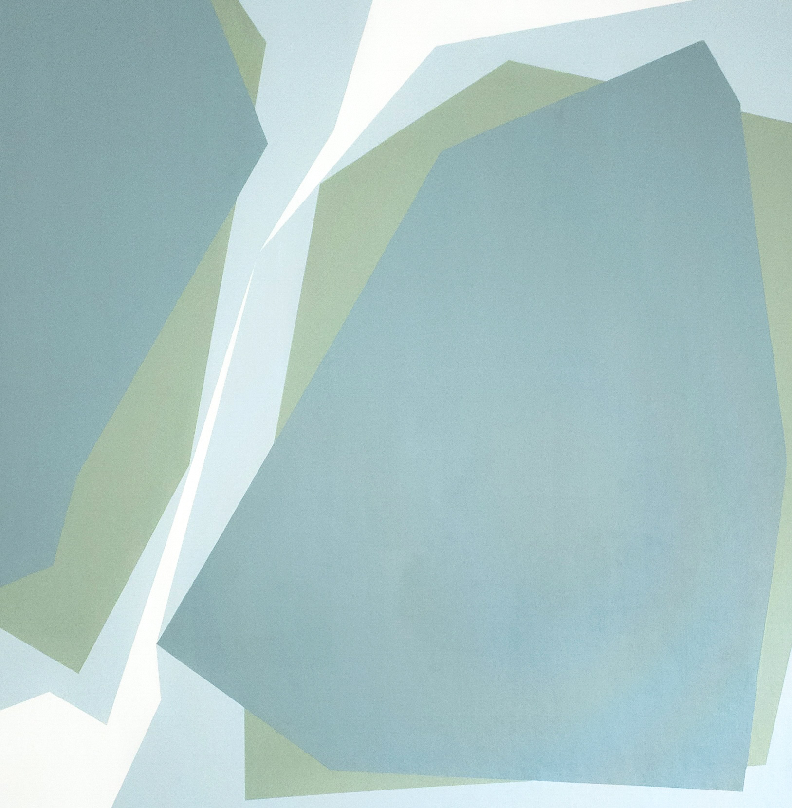
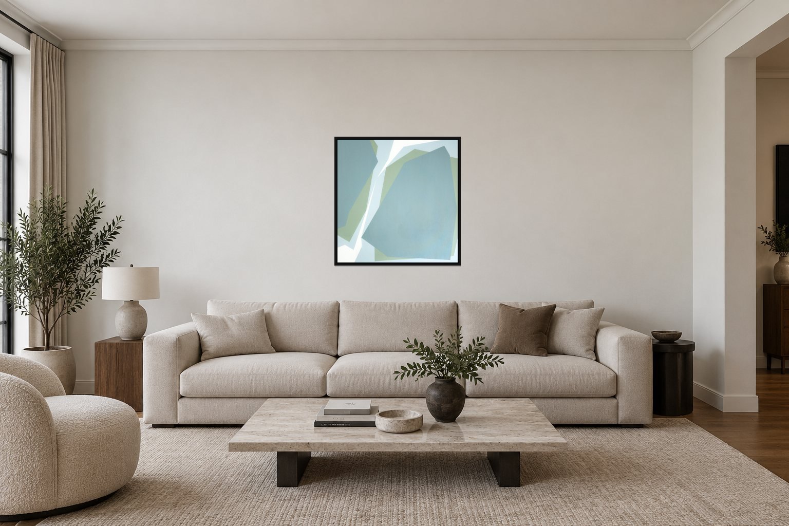
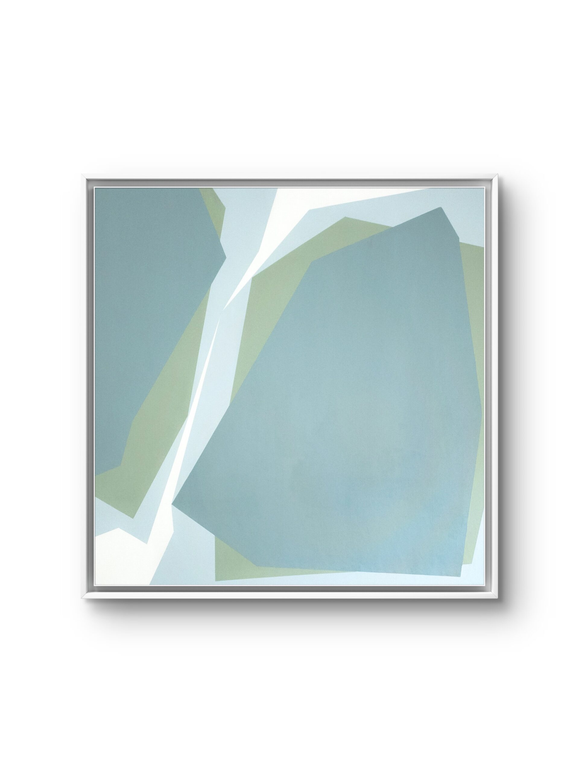
In BREAK 42, the choice of hue is as important as the construction of form. Subtle differences between closely related colours alter the visual weight of the planes and the balance of the composition as a whole. Crisp edges preserve the clarity of the geometry, while the gentle interplay of colours lends it lightness. Together, these qualities suggest how a rigorous form can acquire elegance.
Reducing the visual language to a few elements brings the contribution of each into focus. Line defines form and gains expressive force through its relationship with colour. What serves as a boundary within the composition becomes a focus of attention in its own right. This shift is central to the work’s intention: to make it possible to see beauty in the line itself and to discover more in a simple form than it reveals at first glance.